Australian Senator Steve Fielding has attracted quite a bit of media attention with his series of stunts aimed at building doubt over the scientific basis for anthropogenic global warming. The core of his campaign has been a carefully constructed graph which shows no clear rise in temperatures while CO2 continues to rise since 1995. The implication is that the world is not warming and CO2 is not (directly) related to temperature.
Trouble is, he (apparently) thinks he’s looking at climate – but he’s not. He’s looking at the weather.
Climate is defined as the long-term average weather, where “long term” is generally accepted to mean at least 30 years. Anything on a shorter time scale is dominated by short term variability: weather.
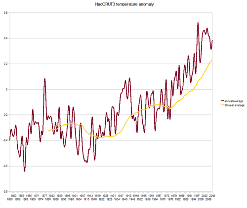
The graph Fielding cites shows year-by-year data: annual average global surface temperatures. So each data point is the average of a one-year period. That’s a nice picture of the weather; but why don’t we take a look at the climate?
Here’s a graph from the same data set (Hadley CRUT3) showing the annual average temperature (the brown spiky line, jumping up and down all the time) and the 30-year average temperature (the smooth yellow line).
Brown = weather. Yellow = climate.
Clear?

#1 by Magnus Andersson on September 14, 2009 - 7:09 pm
Quote
Yellow climate? Since climate is the average weather (including temperature) of at least 100 years (some meteorologists, but not often climatologists, say 30 years) I think you mix up stuffs.
Also changes in climate happens, when the yeallow weather line goes up and down. Show me a graph over 2000 years, and then we can start to talk about climate. I like this high quality multi-proxy reconstruction by Dr Craig Loehle:
http://farm4.static.flickr.com/3245/2660094285_cc027a098c_o.jpg
best regard, Magnus Andersson (and beware current false climate discourse 😉 )
#2 by matt on September 14, 2009 - 8:03 pm
Quote
Hi Magnus, thanks for the comment. I think the 30-year level is pretty widely used among climatologists, though. I have seen several of the world’s top climatologists use the phrase “at least 30 years” when defining climate; though always with a qualifier that there are aspects of the record on shorter timescales of interest, of course. There have been occasions when major climate shifts have taken place within a decade, or even one year; and the variability of temperature and other factors on short timescales is an important part of the total climate picture.
Given that the issue at hand is anthropogenic climate change due to greenhouse gas emissions, for which the primary change has happened in the last 150 years, with substantial acceleration since 1970, it’s interesting but not directly relevant to look at 100-year averages or the 2000-year record. The main issue is minimising the effect of short term variability, which a 30 year average does much better than a one-year average.
The problems with Loehle’s reconstruction are widely recognised: see an introduction to the issues here.
#3 by Magnus Andersson on September 14, 2009 - 9:07 pm
Quote
Real Climates maybe most important sentence, and you know that: “The Loehle paper was published in Energy and Environment – a journal notable only for its rather dubious track record of publishing contrarian musings”.
The points of critics RC have isn’t a rebutal, but a shatter about details to put Loehle in doubt. E g the date issue is a detail, but Loehle hndle it right, and the data belongs to present publishded proxy studies Loehle uses. I haven’t seen Real Climate criticize the abundance of proxy studies which exists.
They have this post with shatter agains a real lproxty data report because Real Climate exists and was cerated to defend Mann’s hockey stick. (I’m pretty sure you know this too.)
Actually there are globally hundreds of proxy studies which consistently (at least 95 percent) show the medieval warm period with more than 50 years of wearmer temperatures than the warmest temperature during the 20th century as well as showing the little ice age. Globally!
You can compare this usage of existing proxy data with Michael Manns very limited set of (doubtful) three ring data on the northern hemisphere. Michael Manns biggest error was however the change of mean value in computation, so that he got the hockey stick shape. In an experiment with computation of Manns method on completely rubbish noise data 99 percent of 1000 sets of the sets produced the hockey stick! Read NAS authority Wegman’s report.
–
Btw Gavin Smith at Real Climate was involved in replication for the reconstruction, but I don’t remember if he delivered anything. This AGW business is dirty political discourse.
#4 by matt on September 14, 2009 - 9:35 pm
Quote
Hmm, a few recycled myths there, I’m afraid.
If you’d care to cite exactly where to find these hundreds of proxy studies showing a global MWP warmer than the last two decades, I’m sure the climate scientists of the world would be very interested.
There are specific points raised in the RealClimate piece on Loehle which demonstrate the weakness of the result. The most important ones have not been rectified in Loehle’s revision.
I’m afraid you can’t just dismiss the entire body of knowledge on RealClimate just because denialists continue to cling to a series of myths about the “hockey stick”. Science requires specific rebuttals of individual assertions.
You may or may not be aware that the “hockey stick” has been comprehensively validated by other reconstructions since – see IPCC AR4.